Featured Artist | March 2026
Steven Skaggs
Tell us about your practice as a maker.
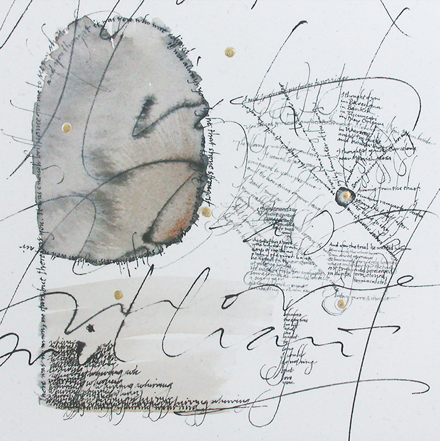
Yr More Brilliant © Steven Skaggs
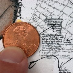
Yr More Brilliant (Detail) © Steven Skaggs
My visual work has always had to do with the alphabet. It’s an amazing thing that we humans evolved these signs that are not only visual things but that also communicate language. When it comes to fine art, which I rarely practice anymore, my interest has to do with expression and the region of the barely legible. When you cannot quite read something, it still communicates so much feeling in how it is written. Then sometimes you suddenly can read it and the verbal information interacts with those feelings. That is a magical moment you don’t get with legible calligraphy or typography. I have experimented with these concepts in all sorts of ways: sometimes I write very legibly but in a size too small to see. I also have worked with calligraphy that is very formal interacting with the very informal; that juxtaposition creates interesting tensions. But, unlike Laurie, I don’t have an insatiable need or internal drive to make for the sake of making, or to do fine art. I have discovered I need an audience. I’m interested in the ideas which the thing exemplifies. Maybe that’s why in recent years I have spent less time making things and more time writing about them. It’s depressing when stacks of things pile up in your studio – what do you do with all this stuff?! I can store all my essays on a thumb drive.
The font Loniki © Steven Skaggs
Where do you thrive? Where do you struggle?
Because I love thinking and ideas, I thrive in my work in semiotics (i.e. symbology, the study of how things come to mean something). I also thrive in anything having to do with the alphabet. I enjoy designing fonts. I struggle with the infrastructure and mechanism of the fine arts. I feel lonely when I do art. It’s very isolating to have such an intense interest yet feel unconnected to a public. Who/what influences you?
I have a lot of heroes: Hermann Zapf (with whom I studied in 1980 and 1981), Gottfried Pott, many other classical and contemporary calligraphers. Classical modernist graphic designers such as Massimo Vignelli, Herb Lubalin, Josef Müller-Brockmann, Cipe Pineles. Philosophy and semiotics: big fan of Charles Sanders Peirce (American Pragmatist), Umberto Eco, and in terms of fluid writing style, Floyd Merrell.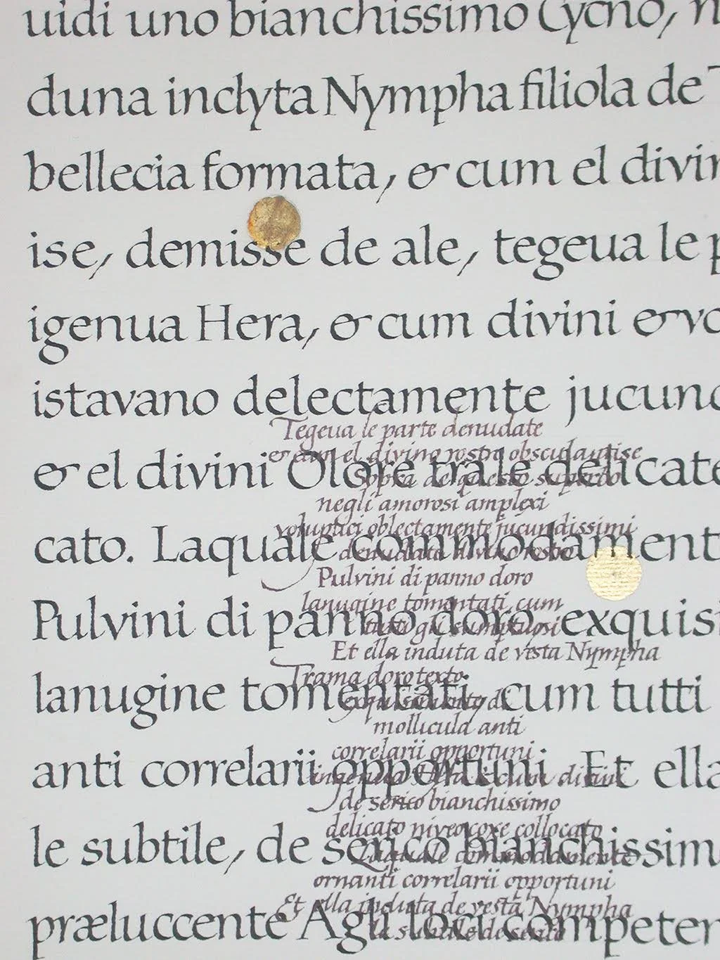
Variations on a Classical Text (detail) © Steven Skaggs
Can you tell us about your books?
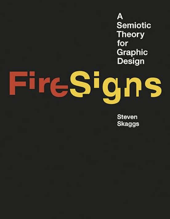
I turned from making calligraphic paintings to writing the books about twenty years ago. I’ve written three books. The first, Logos, traces the development of a logo through all 250 sketches talking about the thinking process behind each step. It’s no longer in print. My second book is called FireSigns. It is the product of a lot of years of study in semiotics and applies what I learned there to graphic design. My third book was just published recently; The Hidden Factor was written for a general audience and shows how just about all man-made signs come from some blend of image, mark, and word. I’ve been very fortunate to work with MIT Press for my last two books. FireSigns was part of a formatted series, but with Hidden Factor they allowed me to design the cover, the guts, and the entire thing (which is rare) so I really feel that whole project is 100% mine.
What is one intention you have for your practice this year?
I just sent out for publication a technical article on semiotics which took me seven months to write (!) so I’ve accomplished one of my New Years resolutions. I plan to finish the expansion of my typeface Loniki. We’re expanding it to all weights as a variable weight font. The drafting of the glyphs was completed last year, but there are a lot of corrections, additions, editing yet to be done. I do this work with my font publisher Delve Withrington. We hope to complete this work by summer. Also, I’m reviewing my semiotics publications from the last decade to see if there might be the skeleton of a book there. But no promises until I take a closer look!

Steven Skaggs Artworks in Public Collections
Klingspor Museum (Offenbach, Germany)
Akademie der Kunste, (Berlin Germany)
Marvin Sackner Collection (University of Iowa)
Hite Institute of Art and Design (University of Louisville Art Collection)
Steven Skaggs Books (published by MIT Press)
The Hidden Factor (2023)